On this page
Release phases
We are at the release candidate and have stabilized.
-
Alpha - 2.0.0-alpha.80 -
Beta - 2.0.0-beta.215 - Release Candidate - 2.0.0-rc.46
- 🫨 2.0 is coming soon
What's the news?
Master CSS 2.0 might be one of the most time-consuming versions, nearly two years since the release of Master CSS v1. During this time, we've been relentlessly developing new features, improving experiences, and laying the groundwork for configurations, with fewer updates.
Thus, there's a plethora of amazing features brewing for a grand explosion upon the official release!
Here's a sneak peek into some of the new features, or you can check out the migration guide from v1 to glimpse at some of the new functionalities.
Master CSS Nuxt
A new integration package, @master/css.nuxt, which helps you set up the Master CSS server in your Nuxt.js project with ease.
export default defineNuxtConfig({ modules: [ '@master/css.nuxt' ]})We will submit it to the Nuxt.js's modules 🤩
Master CSS ESLint
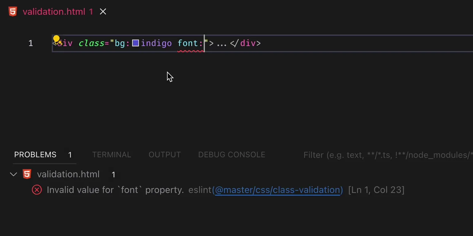
One of our proud products, Master CSS ESLint, the first CSS framework with syntax-error checking in template class="".

Invalid value for `font` property.
<div class="font:">…</div>This is just one of the features, see the Code Linting for complete details.
Master Colors
Refactoring a color palette is a challenging task with no formulas or standards. The all-new colors in 2.0 relies entirely on our experience with UI components and intuitive blending.

There are built-in Master CSS color variables based on theme modes. For example, applying a meticulously designed text color that works in light/dark mode.
<div class="light"> <span class="fg:violet">M</span></div><div class="dark"> <span class="fg:violet">M</span></div>Master CSS's colors have been spun off into a new repository master-co/colors, as motivations always stem from random requests in our community:

Now, you can install it separately anywhere.
npm install @master/colorsMaster CSS Configuration
The protagonist of v2 is here - a brand-new configuration API designed specifically for design systems. For keeping a fresh feeling of what's released, please refer to the documentation first.
Master Theme Mode
Used for setting and switching theme modes, the "packages/theme-mode" has been spun off into a new repository master-co/theme-mode.

In addition to Vanilla, React, and Vue integrations, we also added Svelte support during the migration process ✨
For example, install the stable React version without specifying @rc!
npm install @master/theme-mode.reactJust tweak the import and options, and everything will work as usual.
import { ThemeServiceProvider } from '@master/css.react'import ThemeModeProvider from '@master/theme-mode.react' export default function App({ children }) { return ( <ThemeServiceProvider options={{ default: 'system' }}>{children}</ThemeModeProvider> <ThemeModeProvider preference='system'>{children}</ThemeModeProvider> )}Master Styled Element
The syntactic sugar, styled, for the Master CSS syntax, has been also separated into a new repository, master-co/styled.
This feature was completed nearly two years ago, but due to its entanglement with Master CSS, we couldn't find the right time to unveil it, resulting in highly similar products appearing on the market. Now, it's released independently and marked as stable!
Its uniqueness lies in achieving an extreme size of ~1.5KB using Proxy techniques. You can use it with Master CSS or even Tailwind CSS, and it supports Vanilla, React, and Vue.
It's great if you've used styled-components, styled is inspired by it and has a similar but more concise syntax.
A simple demonstration, create a styled reusable element with just one line of code.
import styled from '@master/styled.react' function Button(props) { return ( <button {...props} className={"inline-flex font:14" + (props.className ? ' ' + props.className : '')}> {props.children} </button> )} const Button = styled.button`inline-flex font:14`And use Button as usual.
<Button className="uppercase">Submit</Button>It will render as:
<button class="inline-flex font:14 uppercase">submit</button>You can use styled as a way to abstract styles.
Master CSS Runtime
The runtime engine of Master CSS has been separated from @master/css into a new package @master/css-runtime, avoiding additional downloads in non-browser environments.
import { initCSSRuntime } from '@master/css';import { initCSSRuntime } from '@master/css-runtime' initCSSRuntime()The CDN is changed to "css-runtime".
<script src="https://cdn.master.co/css"></script><script src="https://cdn.master.co/css-runtime@rc"></script>There are no major changes; it operates as usual.
Master Normal CSS
The "packages/normal.css" for normalizing global styles has been spun off into a new repository master-co/normal.css.
Now, install the stable version without specifying @rc!
npm install @master/normal.css...
There's more, let's save it for a big bang with the v2 release!
Product planning
Initially planned to sprint full throttle towards Master UI after v1's release, but after absorbing some community feedback and delving into more real-world applications, we realized that Master CSS's support for design systems was insufficient. Hence, we focused on strengthening the configuration API and shaping the syntax instead.
We don't want to hastily release peripherals or even paid products before the product matures, leaving a heavy burden for future improvements.
Master CSS 2.0 will be officially released in May, and this year's product plan is confirmed!
| ETA | Product | Introduction | |
|---|---|---|---|
| ✔ | Master Theme Mode | v1.0 | A lightweight utility for switching CSS theme modes |
| ✔ | Master Normal CSS | v2.0 | Normalize browser's styles ~600B |
| ✔ | Master Styled | v2.0 | Create reusable and extensible styled elements in one line |
| ✔ | Master Colors | v2.0 | A crafted color system for beautiful user interfaces |
| Q2 | Master CSS | v2.0 | The CSS Language and Framework |
| Q3 | Master UI | v1.0 | Beautiful components crafted with Master CSS |
| Q4 | Master UI Pro | v1.0 | Professional UIs crafted with Master UI |
| ? | Master AI | v1.0 | Beautiful generative UIs built on Master UI |
Master UI
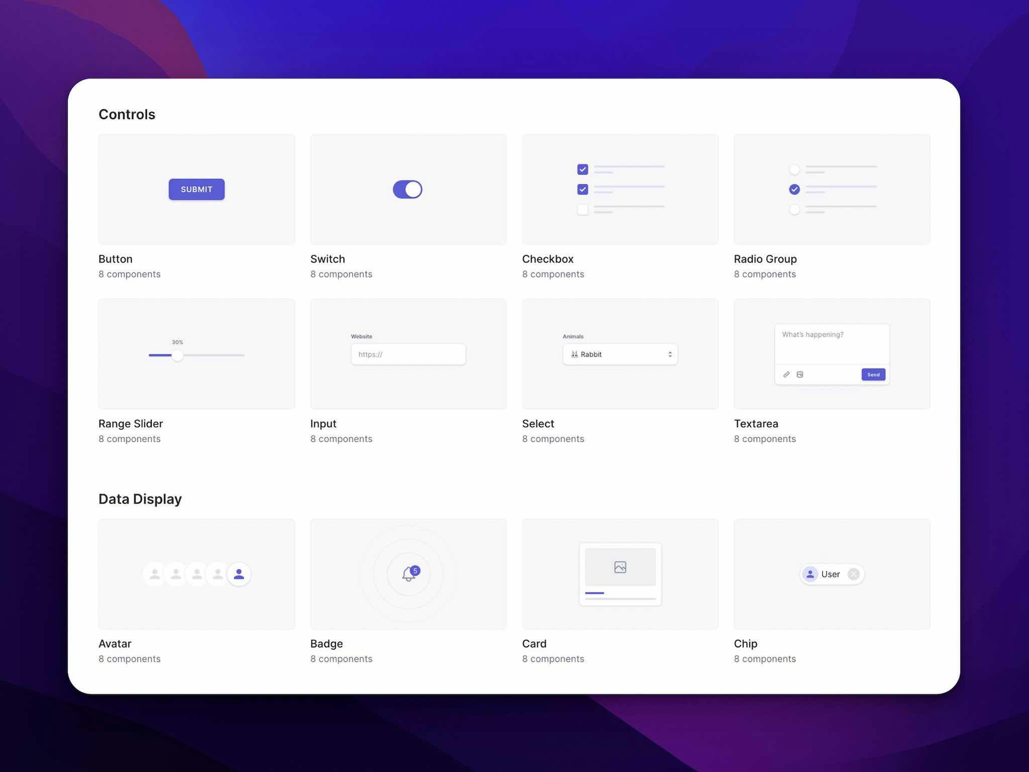
What's heartening so far is that the community is still eagerly awaiting Master UI 😌 With a comprehensive plan in place internally, here's an early disclosure of Master UI's product positioning and solutions.
Master UI is free and MIT licensed, you no longer need to pay for a basic button.

Master UI is a framework-agnostic and framework-friendly UI library.
Even a basic button provides four different ways of use.
We've designed a solution supporting React, Vue, Svelte, Angular, and more popular frameworks.
A. Install and import the React integrated button.
import { Button } from '@master/ui.react' export default function App() { return ( <Button color="indigo">Submit</Button> )}B. Use CLI to clone the React button into the project and modify the source directly.
npx @master/ui add Button.tsxGreat, but what about framework-agnostic?
Master UI can be an Atomic CSS or Semantic CSS UI library.
C. Copy atomic source code from the documentation and modify directly.
<button class="inline-flex bg:indigo fg:white font:14 ...">Submit</button>Or embrace utilities again!
D. Import all Master UI styles in the configuration.
export default { extends: [ require('@master/ui') ]}<button class="btn">Submit</button>We aim to create a CSS framework and UI library that get rid of the fetters of frameworks and factionalism.
Master UI Pro
This will be a professionally crafted UI library based on Master UI, offering components for marketing, e-commerce, applications, and even for different industries.
Lifetime upgrades and access to any future products with just a one-time payment.
We will launch it in Q4 this year, so stay tuned; there might be early bird offers!
What's not perfect yet?
There are still some peripheral features and core documentation that are not yet complete; at this stage, we are working hard to accomplish these tasks.
- Major - Completing Getting Started, Tutorial, Fundamentals, etc., core documentation.
- Minor - Refactoring the Master CSS Language Service based on new features and improving development experience.
- Minor - Basic usage and examples for various syntax documentation.
Major tasks will be completed before the v2 release; minor tasks like extensive use cases of CSS properties will be filled in our future day-to-day work. Here's an example, text-transform:
Heavy Boxes Perform Quick Waltzes And Jigs.
<p class="capitalize">heavy boxes perform quick waltzes and jigs.</p>In conclusion, Master CSS is nearly stable, the biggest reason we haven't released it as stable yet is due to the lack of core documentation.
FAQs
How to keep track of the latest updates?
- GitHub Releases - We've beautified the release changelog, which notes any version and package detailed changes.
- Updates - Discord Channel - We'll post the latest updates in the discord #updates channel.
How to prevent version change conflicts?
When using a CDN in production, pining the current version to avoid potential conflicts due to version changes is strongly recommended, like so:
<script src="https://cdn.master.co/[email protected]"></script>Where is the source code of the documentation?
The official documentation is now open source; welcome to contribute your expertise.